jørn utzon turns 90 today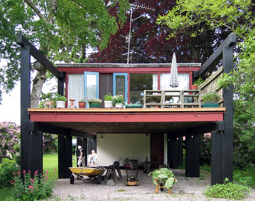
Image by seier+seier
jørn utzon turns ninety today and the Danish press abounds with misinformation about this elusive master of architecture.
"the utzon center" in aalborg, denmark, opens today. designed by utzon with the help of his sons, claim the newspapers. impressive news considering his failing eyesight, not to mention the fact that utzon closed down his office when the production of construction drawings for kuwait national assembly moved to max walt's office in zürich in the mid 1970's.
the utzon center in aalborg is designed by kim utzon, his youngest son, who is also the architect behind another utzon news story today: "jørn utzon designs 22 single family houses in skagen". no, he doesn't. the son does. inspired by his father, no doubt, but a novel inspired by stendhal is not a novel by stendhal. it really is that simple.
another misunderstanding from today, and I quote: "today the opera is being restored following the original drawings". sadly it isn't. it is being restored to designs by jan utzon. his design abilities can be studied here: Las Pulgas
increasingly, I am reminded of the actions of nietzsche's sister and mother after he fell ill.
but members of his family are not the only ones to fail utzon's legacy. today saw the publication of a 260 page book dealing only with his design for the national assembly in kuwait. I left work early to secure a copy for myself. the parliament building has been published extensively already but the three different designs for a mosque that utzon did in connection with it have received little coverage. sadly, the new book is no different.
seen in connection with the fact that a recent book on the church in bagsværd did not include a particular sectional sketch in which the vaults can be seen as a piece of stylized arabic calligraphy, and the fact that richard weston's huge book on utzon dismisses his great design for farum town centre as being too islamic, I can only see this as a sign of today's islamophobia. utzon himself never displayed such sentiments and indeed his work cannot be understood without the east.
in 1948, utzon wrote: "different types of nature arise from the same seeds under different conditions. the conditions in our times are completely different from those that existed before, but the essence of architecture, the seed, is the same".
this belief, that the fundamentals of architecture are the same regardless of culture and age, meant that utzon could learn equally from ancient iranian masters and from modern engineering. ultimately, it means that cultures can learn from each other, that we are not separate but that we share values and experiences intrinsic to being human. in todays political climate, that amounts to optimism. utzon's architecture, said sverre fehn, is world-architecture. I return to it for the comfort of wisdom in an age where exchange between the cultures seems reduced to insult, trade or bullets.
the photo shows an original utzon design:
middelboe house, holte, denmark.
architect jorn utzon, 1953-1955.
photographer is my good colleague christoffer pilgaard.
this photo was uploaded with a CC license and may be used free of charge and in any way you see fit.
more utzon here and here
Taylor Swift - Speak Now (Cover Wars Week 5 Submission)
Image by [ captivated ]
I really, really love the turnout of this.
And I even had to make it at my Grandma's house, LOL!
I just love this album so much, definitely my favorite album EVER.
Every track tells a great story and I would be fine with every track on it as a single, I love them all.
This was my entry for Cover Wars Week 5.
I made the complete album design.
Cover (with sticker): i55.tinypic.com/16l0as0.png
Back Cover: i54.tinypic.com/2rdkl1j.png
Jewel Case: i55.tinypic.com/a3i2ia.png
Disc: i55.tinypic.com/wrbz7t.png
Poster: i56.tinypic.com/p0v0n.png
Purse: i51.tinypic.com/1znqvdt.png
Buttons: i56.tinypic.com/17vhmx.png
T-Shirt: i54.tinypic.com/f22eee.png
Vinyl: i56.tinypic.com/17v8td.png
iPhone Skin: i52.tinypic.com/o6lena.png
Digital Booklet:
Page 1: i55.tinypic.com/10miya0.png
Page 2: i55.tinypic.com/9hthyf.png
Page 3: i51.tinypic.com/2v80mcp.png
Page 4: i52.tinypic.com/2z69uko.png
Page 5: i54.tinypic.com/fy3m0j.png
Page 6: i53.tinypic.com/4qmpw4.png
Page 7: i56.tinypic.com/29bj8yh.png
Page 8: i53.tinypic.com/35kvlva.png
That's a lot of stuff!
We had two weeks to work on our project and I couldn't be prouder of mine!
This week, there were 6 contestants left. Only 3 of us can make it on from this point. I'm really hoping I make it, I would love to battle it out in the finals.
Judges' Critiques:
Creat1ve:
Woah! This has got to be the best stuff I've seen for Speak Now period! Just everything in here goes perfect for the album! Only a few little small things I have to critique though. While the work is just amazing, my only thing is the design is a little repetitive for me. Like I would've loved if some of the images done for the digital booklet would've been included in things like the t-shirt, buttons, stickers, etc. This is all still amazing though, just wish more colors would've been used for the stuff aside from the digital booklet. But other than that, phenomenal job! Just like I told Firedup, you have got to be a professional graphic designer in your future, and this is just a great example of that. :)
Creativity: 20/20
Use of Typography: 20/20
Requirements Present: 20/20
Use of Requirements: 20/20
Overall Compisition: 20/20
Total Score From Creat1ve: 100/100
MyVanity:
I can not get over how good everyone is this week. I know you were doing a TS set but I had no idea if would look this hot! I love the design of the cover, and the over all theme. It's very enchanted, and I think it fits the album perfectly. The poster is one of my favs as well! I would totally buy that poster! The shirt is <3 !!!! Taylor needs you on her team to help design her merchandise! You are a natural
Total Score From MyVanity: 100/100
GimmeThat:
This is so cute! I love the purple theme for everything. It actually looks so professional and I can imagine Taylor's team coming up with something like this. I love the fonts used too, really goes with the images of Taylor. Again, you've also worked extrememly hard. From the digital booklet to all the extra things. You should also be very proud of yourself for creating this.
Creativity: 20/20
Use of Typography: 20/20
Requirements Present: 20/20
Use of Requirements: 20/20
Overall Compisition: 20/20
Total Sore From GimmeThat: 100/100
DIRRTY:
I really love the use of purple in this. The booklet and covers are really fun ...you made it look very summery and vibrant.
Creativity: 19/20
Typography: 19/20
Requirements Present: 20/20
Use of Requirements: 20/20
Overall: 19/20
Total Score From DIRRTY: 97 / 100
Final Score For Captivated: 99.25/100 + 6 Bonus Points = 105.25/100
I hope you guys like this, I'm proud of myself for accomplishing this in 2 weeks!
Episode #7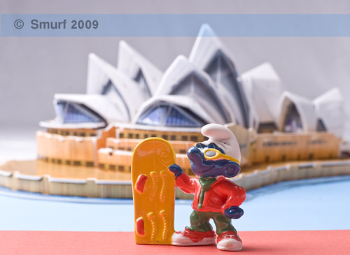
Image by SanforaQ8
** Sydney Opera House , is one of the most famous building in the World. It is considered to be one of the most recognizable images of the modern world although the building has been open of only about 30 years.
6225 square meters of glass and 645 kilometers of electric were used to build the Opera House. It includes 1000 rooms, it is 185 meters long and 120 meters wide. The buildings roof sections weigh about 15 tons. There are 1 million tiles on the roof. It provides guided tours to 200 000 people each year.
.
Character : SnowBoard Smurf
Camera : FujiFilm FinePix S5Pro
Lens : Nikon 50mm
Home Studio.
**Thanx To My Sis thaliakuwaiti To helping me For Background Design
--------------------------------------------------------------------------------------
© All rights reserved to sanfora
No comments:
Post a Comment